Subtotal: 63,40€ (incl. VAT)
Behind the painstaking process of creating Chinese computer fonts
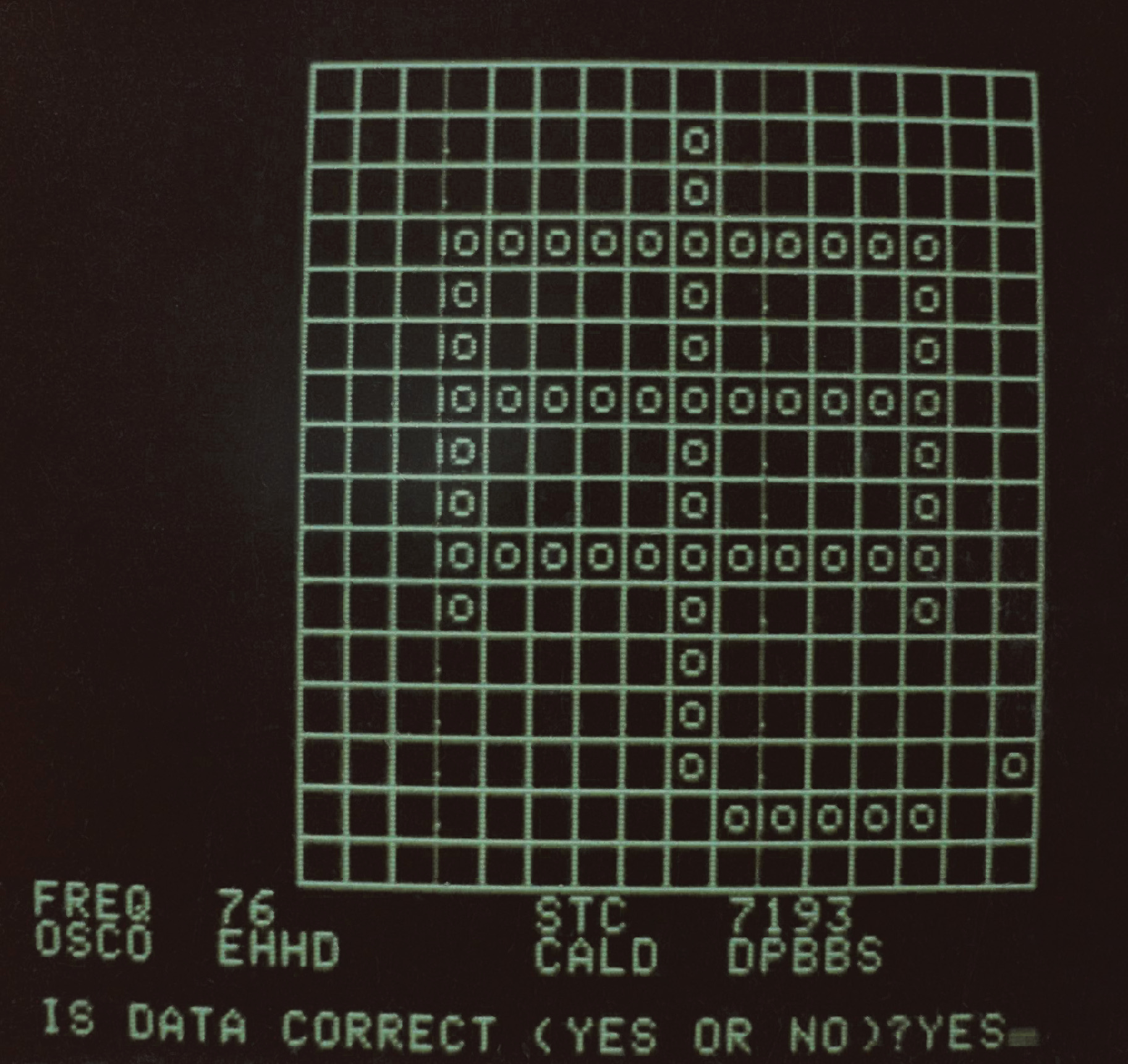
Bruce Rosenblum switched on his Apple II, which rang out a high F note followed by the clatter of the floppy drive. After a string of thock thock keystrokes, the 12-inch Sanyo monitor began to phosphoresce. A green grid appeared, 16 units wide and 16 units tall. This was “Gridmaster,” a program Bruce had cooked up in the programming language BASIC to build one of the world’s first Chinese digital fonts. He was developing the font for an experimental machine called the Sinotype III, which was among the first personal computers to handle Chinese-language input and output.
At the time, in the late 1970s and early 1980s, there were no personal computers being built in China. So to make a “Chinese” PC, Rosenblum’s team was reprogramming an Apple II to operate in Chinese. His list of tasks was long. He had to program an operating system from scratch, since Apple II’s DOS 3.3 simply wouldn’t allow the inputting and outputting of Chinese-character texts. Likewise, he had to program the Chinese word processor itself, a job he worked on tirelessly for months.
LOUIS ROSENBLUM COLLECTION, STANFORD UNIVERSITY LIBRARY SPECIAL COLLECTIONS
While Gridmaster may have been a simple program, the task that it would be used to accomplish—creating digital bitmaps of thousands of Chinese characters—posed profound design challenges. In fact, creating the font for Sinotype III—a machine developed by the Graphics Arts Research Foundation (GARF) in Cambridge, Massachusetts—took far longer than programming the computer itself. Without a font, there would be no way to display Chinese characters on screen, or to output them on the machine’s dot-matrix printer.
For each Chinese character, designers had to make 256 separate decisions, one for each potential pixel in the bitmap. (A bitmap is a way of storing images digitally—whether as a JPEG, GIF, BMP, or other file format—using a grid of pixels that together make up a symbol or an image.) Multiplied across thousands of characters, this amounted to literally hundreds of thousands of decisions in a development process that took more than two years to complete.
Programming Gridmaster—which in hindsight Rosenblum described to me as “clunky to use, at best”—enabled his father, Louis Rosenblum, and GARF to farm out the responsibility of creating the digital font. Using any Apple II machine, and running Gridmaster off a floppy disc, data entry temps could create and save new Chinese character bitmaps, remotely. Once these bitmaps were created and stored, the Rosenblums could install them on the Sinotype III by using a second program (also designed by Bruce) that ingested them and their corresponding input codes into the system’s database.
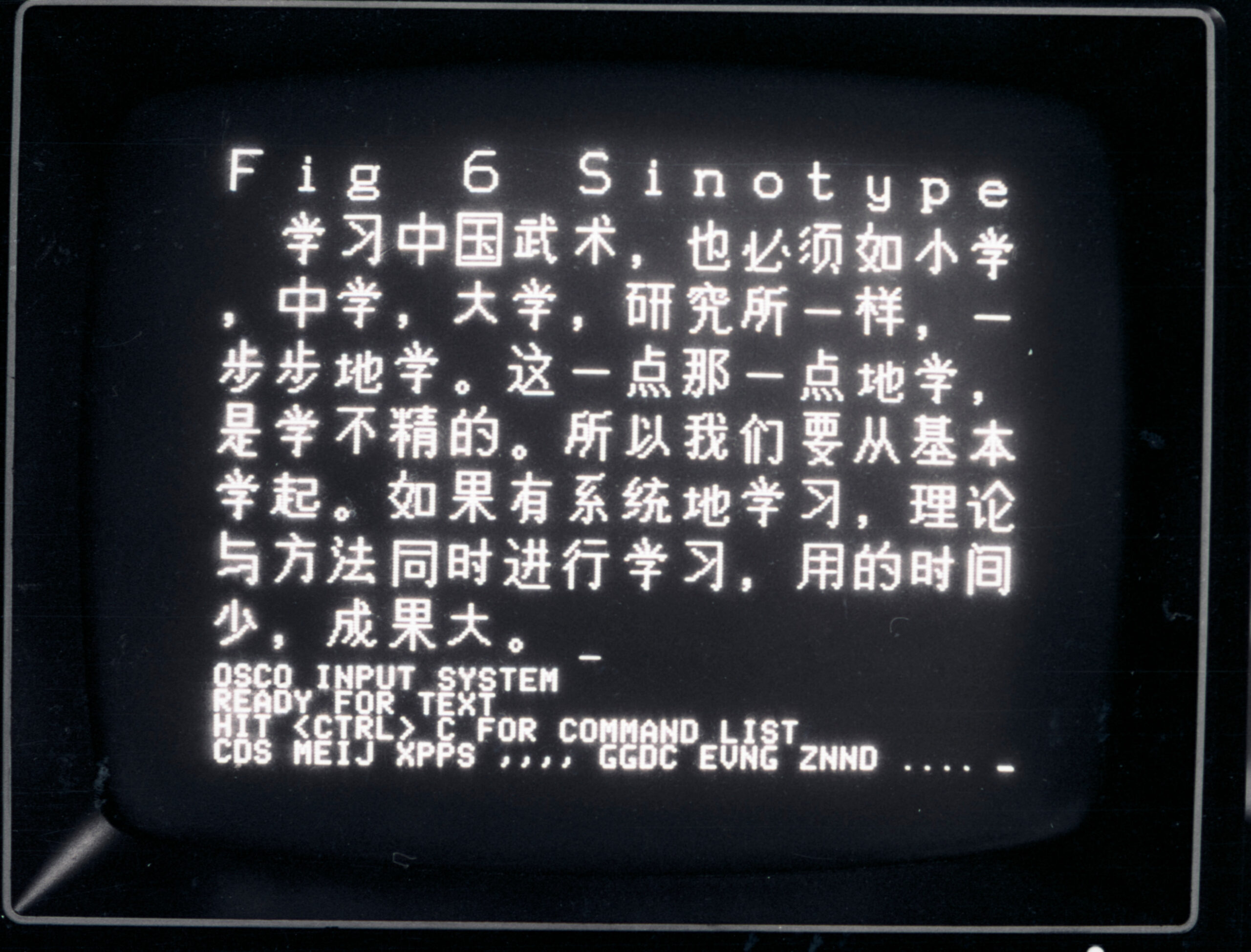
Sinotype III was never commercially released. Nevertheless, the painstaking work that went into its development—including the development of this bitmap Chinese font—was central to a complex global effort to solve a vexing engineering puzzle: how to equip a computer to handle Chinese, one of the most widely used languages on Earth.
LOUIS ROSENBLUM COLLECTION, STANFORD UNIVERSITY LIBRARY SPECIAL COLLECTIONS
At the advent of computing and word processing in the West, engineers and designers determined that a low-resolution digital font for English could be built upon a 5-by-7 bitmap grid—requiring only five bytes of memory per symbol. Storing all 128 low-resolution characters in the American Standard Code for Information Interchange (ASCII), which includes every letter in the English alphabet, the numerals 0 through 9, and common punctuation symbols, required just 640 bytes of memory—a tiny fraction of, for example, the Apple II’s 64 kilobytes of onboard memory.
But there are tens of thousands of Chinese characters, and a 5-by-7 grid was too small to make them legible. Chinese required a grid of 16 by 16 or larger—i.e., at least 32 bytes of memory (256 bits) per character. Were one to imagine a font containing 70,000 low-resolution Chinese characters, the total memory requirement would exceed two megabytes. Even a font containing only 8,000 of the most common Chinese characters would require approximately 256 kilobytes just to store the bitmaps. That was four times the total memory capacity of most off-the-shelf personal computers in the early 1980s.
As serious as these memory challenges were, the most taxing problems confronting low-res Chinese font production in the 1970s and 1980s were ones of aesthetics and design. Long before anyone sat down with a program like Gridmaster, the lion’s share of work took place off the computer, using pen, paper, and correction fluid.
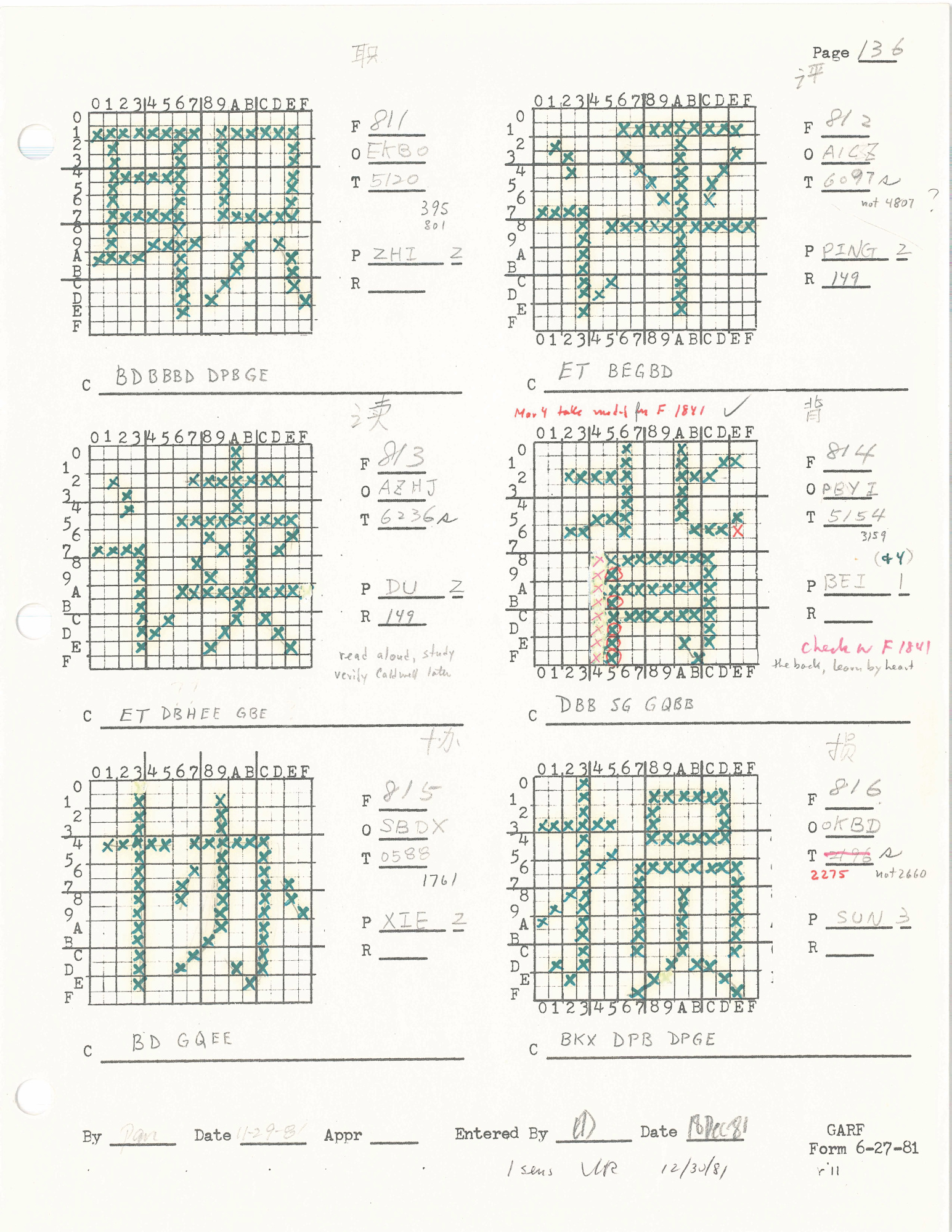
Designers spent years trying to fashion bitmaps that fulfilled the low-memory requirements and preserved a modicum of calligraphic elegance. Among those who created this character set, whether by hand-drawing drafts of bitmaps for specific Chinese characters or digitizing them using Gridmaster, were Lily Huan-Ming Ling (凌焕銘) and Ellen Di Giovanni.
LOUIS ROSENBLUM COLLECTION, STANFORD UNIVERSITY LIBRARY SPECIAL COLLECTIONS
The core problem that designers faced was translating between two radically different ways of writing Chinese: the hand-drawn character, produced with pen or brush, and the bitmap glyph, produced with an array of pixels arranged on two axes. Designers had to decide how (and whether) they were going to try to re-create certain orthographic features of handwritten Chinese, such as entrance strokes, stroke tapering, and exit strokes.
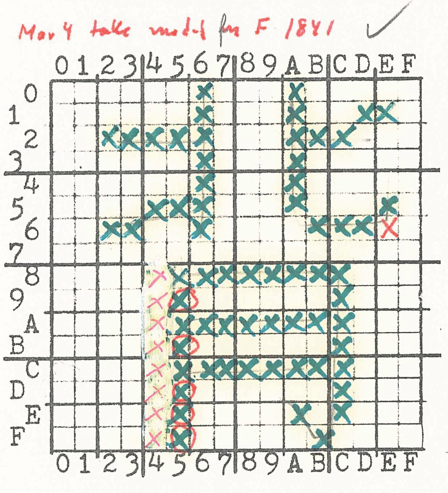
In the case of the Sinotype III font, the process of designing and digitizing low-resolution Chinese bitmaps was thoroughly documented. One of the most fascinating archival sources from this period is a binder full of grids with hand-drawn hash marks all over them—sketches that would later be digitized into bitmaps for many thousands of Chinese characters. Each of these characters was carefully laid out and, in most cases, edited by Louis Rosenblum and GARF, using correction fluid to erase any “bits” the editor disagreed with. Over top of the initial set of green hash marks, then, a second set of red hash marks indicated the “final” draft. Only then did the work of data entry begin.
LOUIS ROSENBLUM COLLECTION, STANFORD UNIVERSITY LIBRARY SPECIAL COLLECTIONS
Given the sheer number of bitmaps that the team needed to design—at least 3,000 (and ideally many more) if the machine had any hopes of fulfilling consumers’ needs—one might assume that the designers looked for ways to streamline their work. One way they could have done this, for example, would have been to duplicate Chinese radicals—the base components of a character—when they appeared in roughly the same location, size, and orientation from one character to another. When producing the many dozens of common Chinese characters containing the “woman radical” (女), for example, the team at GARF could have (and, in theory, should have) created just one standard bitmap, and then replicated it within every character in which that radical appeared.
No such mechanistic decisions were made, however, as the archival materials show. On the contrary, Louis Rosenblum insisted that designers adjust each of these components—often in nearly imperceptible ways—to ensure they were in harmony with the overall character in which they appeared.
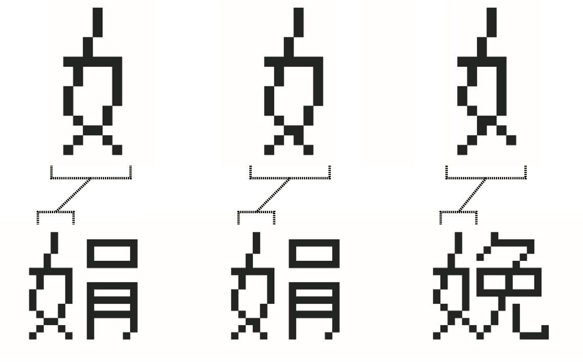
In the bitmaps for juan (娟, graceful) and mian (娩, to deliver), for example—each of which contains the woman radical—that radical has been changed ever so slightly. In the character juan, the middle section of the woman radical occupies a horizontal span of six pixels, as compared with five pixels in the character mian. At the same time, however, the bottom-right curve of the woman radical extends outward just one pixel further in the character mian, and in the character juan that stroke does not extend at all.
LOUIS ROSENBLUM COLLECTION, STANFORD UNIVERSITY LIBRARY SPECIAL COLLECTIONS
Across the entire font, this level of precision was the rule rather than the exception.
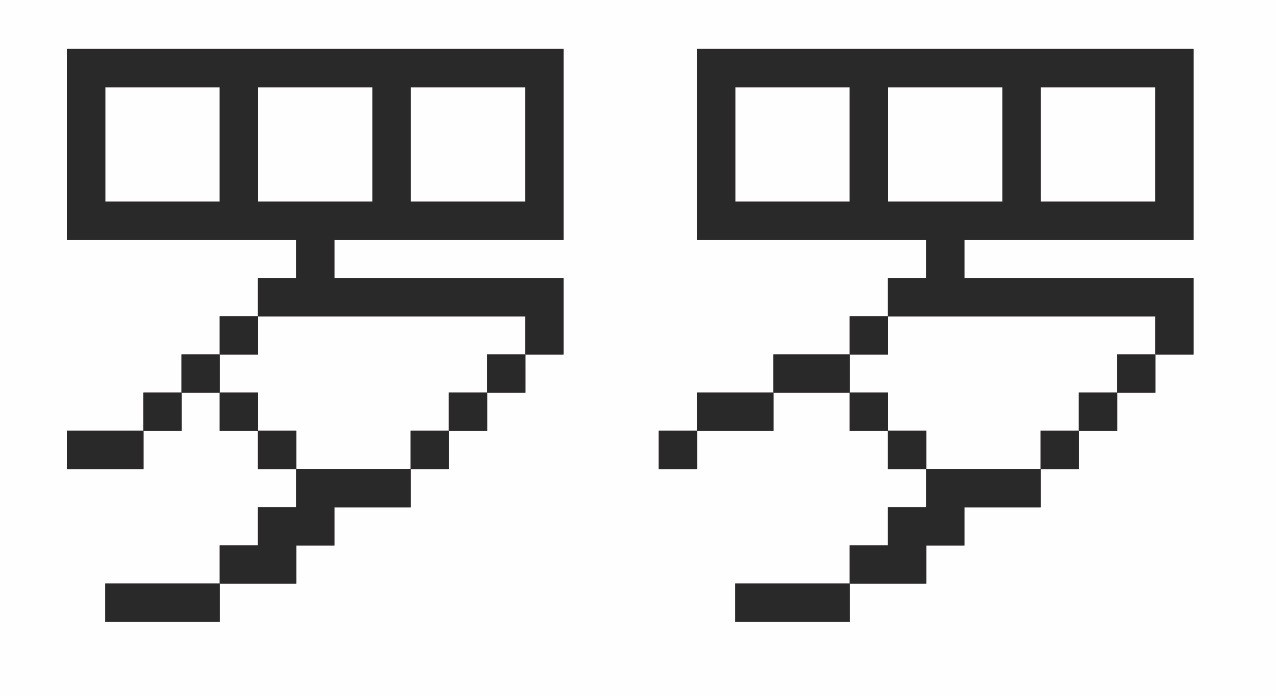
When we juxtapose the draft bitmap drawings against their final forms, we see that more changes have been made. In the draft version of luo (罗, collect, net), for example, the bottom-left stroke extends downward at a perfect 45° angle before tapering into the digitized version of an outstroke. In the final version, however, the curve has been “flattened,” beginning at 45° but then leveling out.
LOUIS ROSENBLUM COLLECTION, STANFORD UNIVERSITY LIBRARY SPECIAL COLLECTIONS
Despite the seemingly small space in which designers had to work, they had to make a staggering number of choices. And every one of these decisions affected every other decision they made for a specific character, since adding even one pixel often changed the overall horizontal and vertical balance.
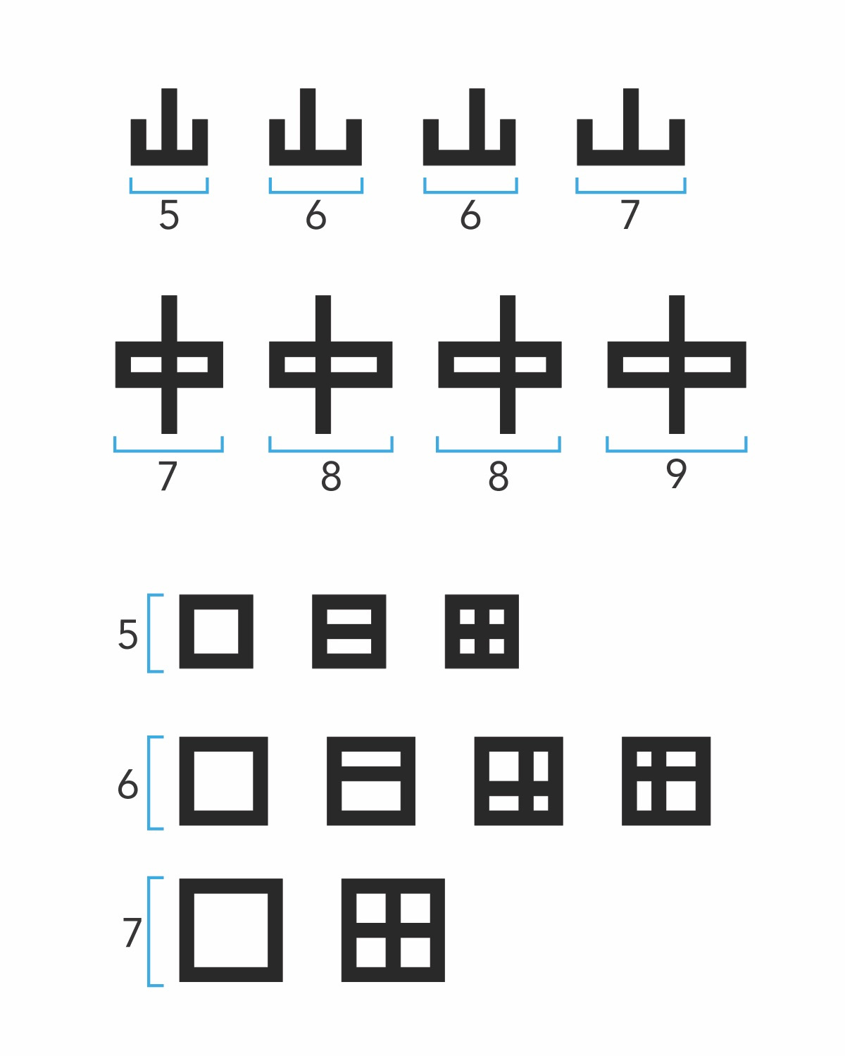
The unforgiving size of the grid impinged upon the designers’ work in other, unexpected ways. We see this most clearly in the devilish problem of achieving symmetry. Symmetrical layouts—which abound in Chinese characters—were especially difficult to represent in low-resolution frameworks because, by the rules of mathematics, creating symmetry requires odd-sized spatial zones. Bitmap grids with even dimensions (such as the 16-by-16 grid) made symmetry impossible. GARF managed to achieve symmetry by, in many cases, using only a portion of the overall grid: just a 15-by-15 region within the overall 16-by-16 grid. This reduced the amount of usable space even further.
LOUIS ROSENBLUM COLLECTION, STANFORD UNIVERSITY LIBRARY SPECIAL COLLECTIONS
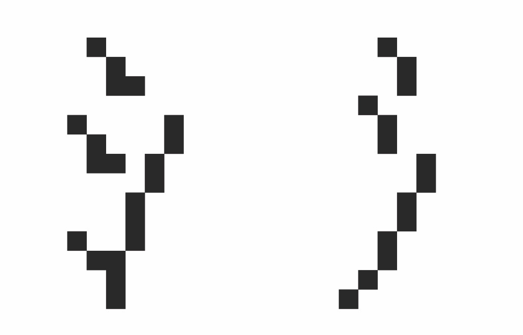
The story becomes even more complex when we begin to compare the bitmap fonts created by different companies or creators for different projects. Consider the water radical (氵) as it appeared in the Sinotype III font (below and on the right), as opposed to another early Chinese font created by H.C. Tien (on the left), a Chinese-American psychotherapist and entrepreneur who experimented with Chinese computing in the 1970s and 1980s.
LOUIS ROSENBLUM COLLECTION, STANFORD UNIVERSITY LIBRARY SPECIAL COLLECTIONS
As minor as the above examples might seem, each represented yet another decision (among thousands) that the GARF design team had to make, whether during the drafting or the digitization phase.
Low resolution did not stay “low” for long, of course. Computing advances gave rise to ever denser bitmaps, ever faster processing speeds, and ever diminishing costs for memory. In our current age of 4K resolution, retina displays, and more, it may be hard to appreciate the artistry—both aesthetic and technical—that went into the creation of early Chinese bitmap fonts, as limited as they were. But it was problem-solving like this that ultimately made computing, new media, and the internet accessible to one-sixth of the global population.
Tom Mullaney is a professor of Chinese history at Stanford University, a Guggenheim fellow, and the Kluge Chair in Technology and Society at the Library of Congress. He is the author or lead editor of six books, including The Chinese Typewriter, Your Computer Is on Fire, and the forthcoming The Chinese Computer—the first comprehensive history of Chinese-language computing.

